 Sumi Workbook
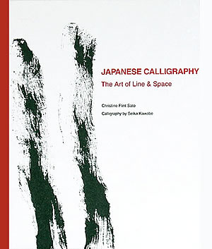
| ⇒ ENGLISH |
日本の書:線と空間の芸術
この本は、日本の書の美について書かれたものです。
1982年から1992年までの10年間、川邊清華師の元で学んでいる間、繰り返し繰り返し聞いた言葉がありました。書の美、つまり線と空間の美についてです。
もっと知ろうと英文で探してみましたが、書の美しさについて書かれている本はそれほど多くありません。そこでこの線と空間の美について書くことを決心したのです。
本を書くにあたり、教室で学んだことを元にしながらも、他の資料を調べる必要がありました。’


本文、前書きより(Excerpt from the Preface)
‘This book grew out of the many notes I took while studying calligraphy under Seika Kawabe between 1982 and 1992. During our classes I found there were certain words and phrases which came up over and over again and which indicated two areas of overriding concern: the line and the space. This book is structured accordingly and built round what I learned in the classes. Although I rely heavily on Seika Kawabe as my source, I have interpreted and built the context in which to understand the language of the art from my own readings.’

本文、前書きより(Excerpts from the Introduction)
‘The two formal elements in calligraphic art are the black line and the white space. The black of the line is Chinese ink, sumi, and the white space the highly absorbent Chinese, Japanese or Korean paper on which the calligraphy is written. Out of these basic elements, both formal and material, is created an art of infinite depth and subtlety which has held the Eastern imagination captive for centuries. It is probably its very simplicity which is part of its charm. It is a simplicity which has given birth to a plethora of expressive line. There are as many lines as there are calligraphers who write. The scripts have certain conventions that should be followed, but the lines themselves are unique to the person writing them. (……)
In this book I deliberately concentrate on these two basic elements, the line and space, to grasp the essence of the art as securely as possible. It means that I do not examine the Chinese characters and hiragana (the Japanese phonetic script form) themselves. (……)
This minimalist approach is not without foundation calligraphically. There is a highly developed Japanese vocabulary and phraseology referring to line and space distinct from scriptural or stylistic variation. I introduce many of these phrases. Secondly the enjoyment of the cursive script is predominately visual as the characters are often illegible. This is especially so nowadays. Lastly an abstract calligraphy in which the character is not necessarily used or, if it is, is indiscernible, has developed successfully since the war. (……)
After the war(…) most calligraphic movements began actively reassessing the art (of calligraphy) and the emphasis moved from education to expression. Of the various
new groups which sprung up it is from within the rather small avant-garde movement that the clearest statements about the art of calligraphy are to be found. Although radical and somewhat controversial, the ideas expounded have been pushed to their logical limits in the work itself. This is seen in particular in the priority given to line over form. As the fundamentals of the art are so clearly outlined in their position, it is the one I use as the base through the book.’ (……)
本文、目次(Table of Contents)
The Calligraphic Line
The Dynamic Line
The Sculptural Line
Practice and Execution
The Natural Line
The Line as Expression of Self
Calligraphic Space
The Language of White Space
The Calligrapher’s Attitude
The Balance of Line and White Space
Hyogen Teishi
The Kana Line and Ma Spacing
Calligraphic Space
The Language of White Space
The Calligrapher’s Attitude
The Balance of Line and White Space
Hyogen Teishi
The Kana Line and Ma Spacing
《本詳細》
| タイトル | : | Japanese Calligraphy: The Art of Line and Space |
|---|---|---|
| 著者 | : | クリスティーン・フリント・サト |
| 出版社 | : | 海風社 1999年 |
| 価格 | : | ¥4,000 |
| ISBN | : | 4876162646 |


